Refreshing The Bassmaster Tournament Brands

In 2009, while working at ESPN Outdoors/B.A.S.S. I had an awesome opportunity of leading a brand refresh for their tournament portfolio.  Through the years, B.A.S.S. created various tournaments including a grassroots program called the Federation Nation Championships, Bassmaster Elite Series, Bassmaster Opens, Bassmaster Women's Tour, and the highest professional tour, the Bassmaster Classic.  All these tournament brands were designed by different people at different times using different styles.  In 2009, we reached a point where we needed to consolidate the brands into one cohesive look to support that these came from the same house.  Not only were the logos different from one another, but they all utilized different nomenclature, and they all felt individual instead of part of a whole.  

The samples below show you the variety of design aesthetics used on all the individual tournaments. They all said something different. 

Bassmaster Tournament marks prior to brand refresh.

Bassmaster Tournament marks prior to brand refresh.

CLEAR BRAND NEEDS
From looking at the brand marks we owned at the time, it was clear the logos needed to look more connected.  I also considered where the logos would be used (in uniforms, print ads, billboards, television brand ID, promotional products, brochures, way-finding signs, etc).  I looked back at what we had and started to draw some concepts based on the most successful designs.  The Elite Series logo was perhaps the most contemporary and engaging of all the marks in the old portfolio.  It was the most different and it aided as the starting point to step from.  After analyzing what I had to work with, I quickly realized that there needed to be a specific hierarchy to settle before finalizing the overall design.  The Bassmaster brand was utilized across all tournaments, therefore it needed to be an important element of the design.  We also needed to showcase the primary brand that started it all, the B.A.S.S. brand, but this presented some challenges.  For the main brand, Bassmaster was the repeated factor on each of the old tour names.  But they all called the Bassmaster brand in different ways.  I took the brand Bassmaster as the primary brand, but connected it to the B.A.S.S. shield through the overall design. The order became clear and worked well across all tours: 1. Bassmaster; 2. Name of Tour; 3. B.A.S.S. shield.  All marks would carry the B.A.S.S. shield as the umbrella brand that held all these tournaments together.

Bassmaster Tournament marks after brand refresh.

Bassmaster Tournament marks after brand refresh.

THE DESIGN PROCESS
At first, I started by creating a couple of shape versions for the overall design of the mark.  The first shape was very similar to the old Elite Series logo, oval in shape without the olive branches.  The second was the shape of a bass fishing boat viewed from the front, with some overlapping graphic elements.  I then proceeded to create shape concepts in Illustrator in order to call out the main shapes that would hold the letterforms of the brand names.  Once the main shapes were identified, I worked in Photoshop to add visual effects and prepared them for presentation.  The second shape ended up winning when I presented the designs to the senior leadership team.  This was the most dynamic and fresh of designs from the two options.

The next step was how to separate these tournaments, besides their naming convention.  We could have simply created one version in one color with the different naming conventions.  There is actually a step process similar to the medal options in an Olympic competition.  In order to qualify to compete in the super bowl of bass fishing competitions, the Bassmaster Classic, an angler has to make it through the Bassmaster Opens and the Bassmaster Elite Series.  Following the metal comparison used for Olympic medals (gold, silver, bronze), I used a bronze color/metal effects to denominate the Bassmaster Opens Tournaments, a silver color/metal effects to denominate the Bassmaster Elite Series Tournament, and a gold color/metal effects to denominate the Bassmaster Classic.  At the time, there was an active Women's Tour, and for this mark, we used a red color/metal effect. Finally, I utilized a blue color scheme representing water to denominate the Federation Nation, which is the originating club where most professional anglers come from eventually.  The design concept was complete.  

The creation of the logos was not as easy as it sounds.  This took hours of work in Illustrator to get the exact shapes needed, then work in Photoshop testing different types of metal effects, colors, special effects, lighting effects, etc.  I especially took care in building lighting effects from different directions so that the marks would look more lively and engaging.  These logos needed to be large enough to be used in billboards or small enough to fit in newspaper or magazine print ads.  Finally, all the logos needed to have excellent visual clarity for use in television broadcasts and digital channels.

In the tournament library, only the professional tournaments carried the full-color three-dimensional design, helping to separate them from the rest.  For each individual logo, I created a vector option of the raster logo design in order to guarantee the quality of the logo if it was blown up for large-scale banners or other large output.

Once the brand marks were approved, the brand style guide was created to incorporate every version needed, such as black and white versions, reversed, and flat versions of each tournament brand.  The style guide included the usual: color styles, do's and don'ts, and specs.

The response from these logos has been very positive.  I will never forget the day when our tournament event director viewed the logos for the first time and said that he would be proud to wear his baseball cap with the new tournament logos on it. 

Tournament Brands in Action From top to bottom: 2016 Bassmaster Classic large scale digital signage, Bassmaster Opens signage and trophy, Bassmaster Elite Series angler collectible cards, The Bassmasters Television Programming.

Tournament Brands in Action
From top to bottom: 2016 Bassmaster Classic large scale digital signage, Bassmaster Opens signage and trophy, Bassmaster Elite Series angler collectible cards, The Bassmasters Television Programming.

Auto Loan Offers that turn heads

The summer of 2015 was hot, really hot, and the same was the expectations to attract new customers to act on our auto loans by the end of summer.  We had done all types of marketing in the past focusing on interest rates, terms, and other features, but this time we started from scratch by splitting our audience into two and designed communications specifically for them based on the features that usually appealed to them as found in research data. 

The creative brief was ambitious: attack the two different audience groups three times in a three-month period by mail using different types of mailers, coupled with three emails that followed up each mailer.  In total, the deliverables were 6 different mailers and 6 different emails. 

For the first piece, we created a self-mailer with 6 panels (three on each side).  This piece reinforced facts about the offer.  The second piece was a letter with a well-designed outer envelope that highlighted how the audience could save more with our offer.  The third piece was a postcard that reinforced a specific benefit of the offer. 


NEW VEHICLE OFFER CREATIVE
For the audience targeted with the new vehicle offer, the look portrayed a close-up of a bright red car, close enough to see the specs of paint.  The headlines were designed to look like chrome logos.  The design was to be simple, to help focus on the message.  The emails also followed the same look but were designed to fit the digital space with strong headers.

Self mailer for new vehicles - Mailer #1

Letter and Envelope for new vehicles - Mailer #2

Post card for new vehicles - Mailer 3

Accompanying Emails for new vehicle offer


PRE-OWNED VEHICLE OFFER CREATIVE
For the audience targeted with pre-owned vehicle offers, we designed the same three mailers and emails but with a different look than the new vehicle offer.  The style utilized pattern in the design which was made profound by the integration of real customer testimonial photography. 

Self-mailer for pre-owned vehicles - Mailer #1

Letter and envelope for pre-owned vehicles - Mailer #2

Post card for pre-owned vehicles - Mailer #3

Accompanying emails for pre-owned vehicle offer

There were constants on both audience creative looks, such as the integration of real customer testimonial photography, the use of our brand colors, and clean design and simple messages that are easy to digest.  Within each campaign, we kept the same fonts and effects to enhance the story from one piece to another.  The project was so well received, it exceeded our loan goals.

Theater Roots

IT ALL STARTED WITH DOLLY
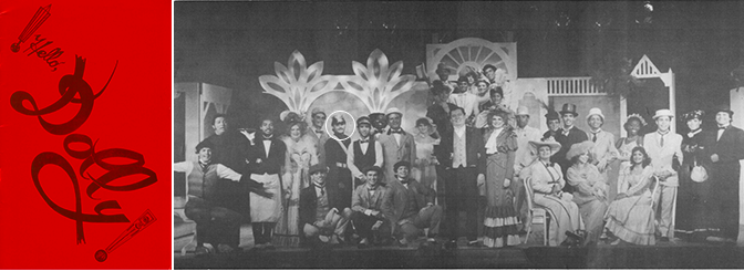
In the summer of 1983, I accompanied a friend who wanted to audition for a musical at Teatro En Circulo, in Panama City.  The show was Hello Dolly, and it was being directed by one of the most important directors in Panama, Bruce Quinn.  I didn't know much about the show other than some memory of Barbra Streisand in the film version.  We arrived at the theater where my friend signed up and waited for her turn to audition.  This was all new to me, not knowing much about the theater other than seeing the Spanish tour of Jesus Christ Superstar earlier that year.  The idea of being part of a show was appealing to me more and more as I sat in the audience watching the audition unfold.  My friend passed the first audition with an assistant to the director and while we waited for her next round, she kept pushing me to audition as well.  I was nervous, and as an introvert, it was very difficult for me to see myself auditioning for a show of this type.  After a moment, and perhaps because of pressure from my friend, I signed up to audition.  I stood up on stage and sang a song with others, and right then and there I was selected.  Unfortunately, my friend wasn't and she didn't talk to me after that.  Never for a moment did I think that I could get a part in a musical, less work for renowned director Bruce Quinn. 

Hello Dolly program and cast photo.

Hello Dolly program and cast photo.

Hello Dolly was not only the first show I ever worked on, but it was the starting point for something that I truly enjoyed doing.  The theater experience filled my heart when I felt lonely, it filled my mind to learn about the discipline required to be successful, and it allowed me the opportunity to make some really good friends. 

Two years later, Bruce Quinn got ready to direct West Side Story at the Panama Canal College Auditorium.  Bruce had actually directed this musical back in 1968 with an unknown Ruben Blades.  I did everything possible to get a part in the show and after an easy audition, I got the part of Luis, a minor role in the Sharks gang.  I was going to be part of this historical moment.  The show was staged in a combination theater in the round connected to a standard stage auditorium.  Bruce updated the look of the show to the 1980s with Punk fashions that included Michael Jackson-type leather jackets to showcase the New York gangs depicted in the story.  For me, it was also interesting how he mixed the Latino and Anglo talent within the show but unlike the story in the musical, the diverse cast got along really well.  I made some really good friends from this experience and learned a lot about staging this difficult play.  The show won best musical in Panama that year. 

West Side Story program and cast photo of the Sharks Gang, with two of my best friends David Silva (standing behind me) and Javier Barahona (sitting next to me).

West Side Story program and cast photo of the Sharks Gang, with two of my best friends David Silva (standing behind me) and Javier Barahona (sitting next to me).

NEW YORK
In the summer of 1985, I had the great opportunity to live in New York for a month between June and July.  Shortly after I arrived there, it was impossible to miss any of the Broadway theater advertising on the streets, television, radio, and newspapers.  Cats at the Winter Garden Theater was the first show I ever saw on Broadway.  The whole theater was decorated to make you feel like you were part of the show.  I was hooked.  Then followed The Phantom of the Opera.  I remember not being able to afford a seat to see that show, so I saw it in a standing section behind the orchestra seats.  It was magical and upscale, what a musical!

Once back in Panama, that same year, I decided to return to the University to continue my studies in Computer Science and immediately signed up for the Teatro El Desvan Drama Club.  I participated in two shows with the University drama club: Las Fisgonas de Paso Ancho by Samuel Rovinski in September 1985 and then Prohibido Suicidarse en Primavera by Alejandro Casona, in December of that same year. 

Between 1986 and 1988 I was fully immersed in full-time work with the Panama Canal Commission and then the U.S. Army South, while also attending the University at night.

1988
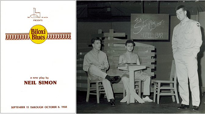
In the summer of 1988, I couldn't resist it and returned to the theater to work for the Theatre Guild of Ancon's production of Biloxi Blues by Neil Simon.  I was cast in the role of Carney, which was perhaps one of the most difficult roles I played because of the unique accent and extensive lines, including a cappella musical numbers alone on stage.  

Biloxi Blues program and cast photo. From left to right: Richard McQuown, me, and Christopher Etter.

Biloxi Blues program and cast photo. From left to right: Richard McQuown, me, and Christopher Etter.

My interest in the theater kept growing beyond acting and once Biloxi Blues was over, I signed up to be a Stage Assistant for the next production at the Theatre Guild of Ancon, the show was The Nerd.  For this show I did a lot of different things that included set construction, painting, setting up lighting, and organizing all the props and set elements.  This show was not only entertaining and fun to work on, but it also taught me a lot about stage management and how important it was to the success of any theater production. 

The last show I was lucky to be part of at the Theatre Guild of Ancon was called Nunsense, by Dan Goggin.  I happened to travel to New York while the show was on rehearsals and was able to speak with Dan Goggin directly on the phone.  Bruce Quinn, who was directing the show had a question about a scene and who better to know than the creator of the show.  Dan was very kind and helpful, as well as excited to know that his play was being produced in Panama.  In Nunsense, I played the part of Stage Manager, which is an actual part on the play but realistically is a real Stage Manager.  The difference here is that the Stage Manager opens the show in full priest attire.  I still remember this show fondly, perhaps because it was the last show I ever worked on before moving to the United States. 

Nunsense program and cast/production photo.

Nunsense program and cast/production photo.

WALT DISNEY WORLD HERE I COME
Fast forward to 1996 in Orlando, Florida, I was working as an Animation Artist for the Magic of Disney Animation Tour when a great opportunity came about to work on Disney's Hunchback of Notre Dame Animation Celebration Show.  The production had toured the country in a popular mall tour earlier that year, and now the show was being cast for a special event that took place at the Disney-MGM Studios (known now as Disney's Hollywood Studios).  The show involved explaining the process of animation and how the film was created to park guests that attended the event.  It was heavily scripted with intricate staging that included playing an automated piano, drawing in front of a camera at an animation desk, and a large monitor wall that showed sequences under the control of the artist.  The three-level set was framed by an oversize open book and was decorated with the look and feel of Disney's Hunchback of Notre Dame film. 

After the Animation Celebration was over, we were told about an upcoming event called the Disney's Hercules Mega Mall Tour which would take place in early 1997.  I was able to get an audition and was hired as a tour back-up animator.  In January of that year, a team of 4 artists was sent to California to train to draw the characters from the film.  We underwent a rigid training program with Feature Animation in Burbank.  We toured the studio and met with animators Nik Ranieri (Hades Animator) and Eric Goldberg (Philoctetes Animator) in order to understand the character personalities.  Half the time was also spent learning the script, staging the show with the director and cast as well as rehearsals.  After the 30-day training, the tour debuted in Atlanta, Georgia.  I was able to tour 13 of the 26 city stops which was a fantastic way of seeing the country.  This has to be one of the biggest highlights of my career at Disney thus far.

My love for the theater has grown through the years and even though my career has taken me in the direction of the graphic arts and marketing, I continue to participate in the theater experience.  in 2012, I had the opportunity to work with a local community theater, Mad Cow Theater, to create poster art for three of their shows: Dancing At Lughnasa, Hedda Gabler, and Private Lives

The fact is that the theater saved me.  The whole experience helped keep my mind busy and focused on something more joyful in the moments when my life wasn't.  It helped me mature into a more responsible individual as well as helped me build genuine relationships with people.  The thrill of being exposed on stage also helped me combat my insecurities and introversion.  It all helped me be who I am today and no one can take that away from me.  I have always believed in living my life to the fullest and if it meant doing something scary, which for me it was totally, then be it.  I did it and it made me a better person for it.

To Cel or not to Cel

After my temporary assignment as an Animation Artist ended in the fall of 1996, I had the incredible opportunity to transition to a small but unique team within feature animation called Ink and Paint.  For those who may not know what a cel is, cel is short for celluloid.  A transparent sheet of plastic made out of celluloid was used to transfer the drawings that made an animation frame.  The lines were inked by hand usually on the front of the cel (before the invention of the xerox machine), while the back of the cell was filled with cel vinyl paints of different colors that made up the character movement of the scene.

I quickly realized that building positive relationships was a winning quality to help achieve my dreams.  Coincidentally enough, a prior supervisor was married to the manager in charge of the ink and paint team at that time and was able to connect me with her in order to test for the position.  

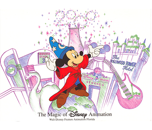
I had never painted an animation cel other than the paint by numbers cels that Disney sold at their stores, but what truly helped in landing the job was the drive and personality that I brought to the summer assignment as an Animation Artist, a job that took me out of my comfort zone every day.  Imagine an introverted and private person, describing the animation technique to a group of strangers.  That was my first artistic job, and what I did on a daily basis as a group after group walked through the Magic of Disney Animation tour, at the Disney MGM Studios (presently called the Disney Hollywood Studios).  Amazingly, a surprising extrovert side of me came out in my presentations.  This job in particular offered me an animation internship with the studio that prepared me to answer any question that our visitors would have about the process of animation.  The internship also exposed me to many artists and animation professionals that shared their talents and experiences with me.  

I passed the ink and paint test and quickly initiated my permanent position with Ink and Paint.  This was especially exciting at that time because this meant that I would be part of the "Show" in the Animation Tour.  At that time, the ink and paint area along with other departments sat in an area coined "the fish tank" where visitors to the Animation Tour could see the artists at work behind large glass windows. The Ink and Paint section included a backdrop of paint glass containers of all the paint colors we'd ever used.  There were 4 rows of 2 animation desks per row that filled the space.  The team consisted of about 5 to 6 artists, not all at one time.

A view of the Ink and Paint studio desks from the audience side of the animation tour back in early 1997.  Getting used to wearing gloves to paint cels was quite necessary to keep the cels from fingerprints, scratches, and dings.

I remember being aware of how distracting and often entertaining the view of the audience was behind the glass.  Waving at the tour visitors behind the glass was a daily event, in addition to the constant glare of the flashes that seemed to bounce from one glass surface to the other around the studio from guests taking photos with flash.  

Of course, the job was not all fun, it was actually quite extensive.  There is a specific process in which animation cels are painted.  Light cotton gloves are required to paint cels in order to keep the cels clean from hand dirt and oils.  The darkest colors are applied first, lightest colors last.  So if I was painting a cel with Mickey Mouse on it, the first color to be applied is black on 8 to 10 cels laid out on various drying racks positioned in front of the desk.  Then one returns to the first cel painted and the next color is applied, let's say red.  The red would be applied to all the cels, and so on until all the areas of the character art are filled.  While our cels had pre-printed lines on the front; for limited edition cels, lines often were applied by hand, an extremely difficult task that only a few artists were able to accomplish.  

Daily cel quotas needed to be fulfilled, which depended on the cel type that was being painted.  I was lucky to come into the team when the first cel available to the consumer was still being painted. It was called Animator Mickey, a beautiful animation cel of Mickey sitting at an animation desk.  Because the cel was so popular, we had to paint this cel at least one day a week in a round of 8 to 10 cels at a time in order to keep inventory.  While it was not the hardest cel to paint, it was still challenging because the areas of paint needed were rather large and knowledge of the consistency of the paint was necessary to understand how much time one truly had to paint the surfaces before creating dry lines within the spaces that were visible on the front of the artwork.

We also painted two compositions that had very small Mickey Mouse poses that had an important connection to the studio, they were the Traveling Mickey (as pictured on the photo above behind my head) and the Climbing Mickey (a re-creation of the statue that welcomes guests into the Animation Courtyard area outside of the Animation Gallery.  The Traveling Mickey was inspired by the animation tour itself.  Throughout the original animation tour, guests were able to see a Mickey in different positions and levels of execution that would explain the animation process in the simplest way.  Therefore, the animation cel was composed of three Mickey's that were printed on an animation background, while the last two Mickey's would be printed on a cel and painted by the artists.  This cel was quite difficult to paint because of the small character size. 

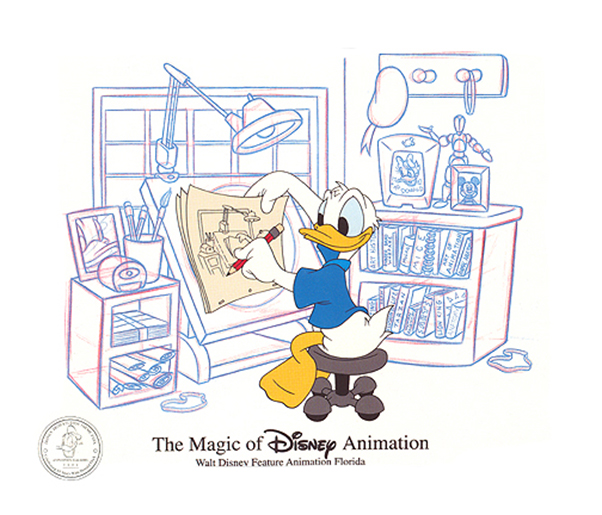
As the studio saw opportunities in celebrations and character popularity, a Donald at the Animator desk was launched, later followed by a Millennium Mickey cel that was only available in the year 2000.

Besides painting in the studio to keep a healthy inventory, we also painted "on stage."  This meant that on one or two days a week, we would work at the animation gallery painting cels in front of our park guests.  It was fulfilling to speak with people from all over the world that was just in awe of the work I was doing at the studio.  It was truly an honor for me to represent the studio while on stage and it’s an experience I will never forget.  People would just stand in front of me sometimes for hours just looking at how I painted cel after cel, and explained the process.

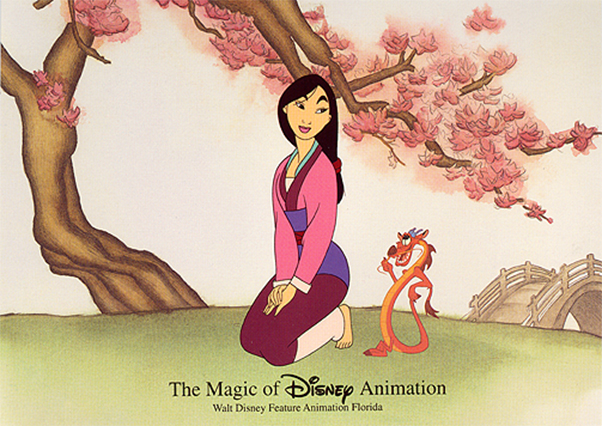
I also had the amazing opportunity to create a watercolor background for a very special cel in my heart called Friendship in Bloom.  The cel was created exclusively by the animation ink and paint team to celebrate the release of Disney's Mulan, which was made entirely at the Florida studio.  I was also able to create the limited edition stamp that was heat-transferred onto the cel to commemorate the film and cel released in 1998.  This was actually the first piece of graphic design I ever created for Disney and an important step toward the future of my career in design.

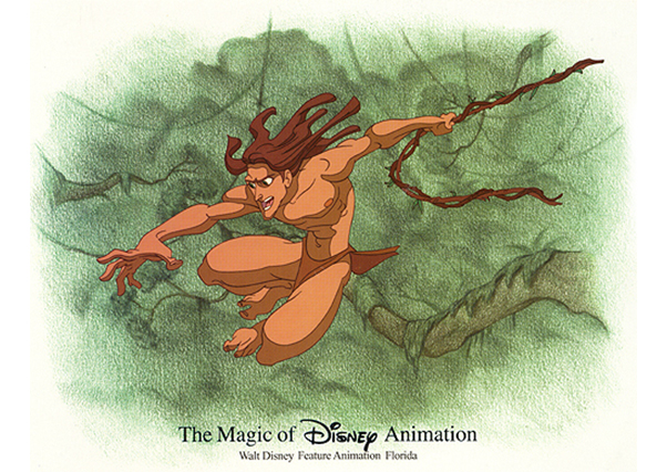
The last cel I painted before leaving the Ink and Paint department was the Tarzan cel back in 2001.  It was an incredibly dynamic cel that was very popular among collectors and animation art enthusiasts.  By the time I left the studio, I had already been exploring a new path in my career in graphic design but I think that I became a better designer thanks to all that I learned while working at the studio that included attention to detail and thinking outside of the box. 

Deploying a new brand of Credit Cards

In looking back at some of the big projects I have worked on in the last year, one comes to mind, the Visa Signature card deployment.  The work involved creating a design for the plastics and then cohesively create the brand identity to support it. 

This journey actually began 3 years ago when I started conceptualizing designs for our plastics portfolio.  We were very limited in what we could do due to some prior Disney corporate relationships, but we took that as a perfect opportunity to strengthen our own brand by creating a pattern of what we call "doinks" (the iconic exclamation point at the end of our brand mark.)

We developed the design to continue the color scheme of the cards.  The style for the Visa Signature launch includes the use of red and black, two of our main brand colors.  Black was used as the ground where to lay the text for the luxury feeling it evokes when placed next to aspirational lifestyle photography.  A light version of Helvetica was used for the copy to make the content easy and inviting to read, while a bold option was chosen for headlines.  We used metal inks for all the copy of the brochures and envelopes to give the presentation a higher quality finish.  Our style guide uses a red bar on the top of our brochure line and to continue the layout style and keep it consistent with other collateral, I created a more upscale bar with a field of doinks and a metal surface effect behind them which plays well with the photo assets below the bar. 

The full campaign includes:

  • two different application brochures (a generic version with a blank application form and a pre-approval letter version),

  • a specially made envelope to accompany the brochure,

  • Push slips,

  • print and electronic posters for displaying at specific branch locations,

  • web site presence (banner ads, carrousel hero image slide, sub-header image, tout image)

How in the world did I get here

In 1976, my parents took my brother and I to Walt Disney World, only 5 years after the park in Florida had opened.  It was not only the first trip to Disney but also the first ever to the United States.  It was also the United States bicentennial anniversary that year, and the park went all out to celebrate it.  This experience left me exposed to a bigger world than I could ever imagine.  It also left me with the dream and inspiration that I could actually do what I really wanted to when I grew up and became a man.  Living in another country, it never crossed my mind that I could live in the United States, less to work for The Walt Disney Company.  But like everything in life is one step at a time, it all happened slowly but surely, I never stopped believing in the dream.

As a child, I knew I was different than other kids around me.  I liked everything that had to do with the arts, and I actually excelled at it in school.  My parents were quite good at drawing and painting so they naturally inspired me but it was not until I was at university studying computer science that I realized that I wanted to follow art and design as my career.  I was failing in almost every class because I really didn't care to learn anything about computers.  I was more interested in drawing the trees I saw outside the classroom window.  Let's say this was my Aha! moment.  In order to find artistic things to do, I signed up at the university theatre club and that opened doors for exposing my work to others.  I was only in my 20's and already printing postcards from my pointillism ink artworks for sale at a chain of supermarkets, which helped advertise my talent to collectors of Panamanian artwork.  In my last years in Panama, I continued to create more work in ink and pencil during the day, while taking the hobby of theatre in the evenings to distract me from the reality of my life.  I was able to work in several productions at the Theatre Guild of Ancon and the Teatro En Circulo, which included Hello Dolly, Nunsense, Biloxi Blues, The Nerd, and West Side Story.

But something felt innately wrong inside of me, I was very unhappy with the outlook of my life in a country that didn't encourage people with a talent for the arts. 

A new chapter of my life began in 1989 when I moved to the United States.  At that time, I was just struggling to survive on my own but one thing was certain, I needed to focus my life on what I really loved, art and design.  In 1994, after taking a good look at my life and where I was headed, I decided to move to Orlando to follow my dream to one day work in the art field at none other, the Disney Company.  I researched hiring opportunities at Disney before moving to the area but it was a gamble moving without a job.  I landed a job at Disney in October of that year.  I came to find out very quickly that I didn't know as much as I thought about Disney.  The Disney Resort complex in Orlando is incredibly large and overwhelming!  After a year and a half of working at the Disney Reservation Center and becoming an expert in everything Disney, I transitioned to the world of art as an animation artist.  At that time, the animation studio was updating the animation tour at the then called Disney-MGM Studios.  They were looking for animation artists to present in a loosely scripted show that would be highlighted by a resident artist from the animation studio.  This step in the right direction, opened doors to connect with a lot of people in animation, and thanks to it, I was able to get a permanent job as an animation ink and paint artist where I worked for 5 years.  It was an incredible experience that I will never forget.  From there, my years at Disney have been a blur, but all filled with excitement.  My artistic career has evolved through the years.  I later transitioned to the graphic design field that I have come to deeply love.  Today, I work for Disney Publishing Worldwide as a Creative Shared Services Manager and my focus of work is designing marketing ads for both print and digital media for many of the Disney brands including Disney-Hyperion, National Geographic Kids, and many more.

On November 20, 2022, I celebrated my 28 years with the company and when I look back at all the years of service, I see a person that never gave up on his dream.  While it is difficult to express how absolutely and emotionally difficult it was to get to where I am today, I can say that even in the moments when I doubted myself, I never gave up on the dream.