Designing Award-Winning Credit Card Campaigns
Earlier this year, I had the opportunity to create a campaign that would help enhance our loan assets by encouraging customers to use their credit cards and be entered to win a trip to a resort in Hawaii. Of course, it had to be our very own Disney Aulani Resort and Spa.
The campaign included a mailer, a pre-approval letter, an email to three different targeted groups, print ads, online and in-branch presence. While this project could have been the standard job where we use characteristic photography assets from the company, we wanted to take the project a step ahead by creating memorable deliverables. We worked closely with the resort brand style guide and went to work with some concepts. All the print materials were created using InDesign.
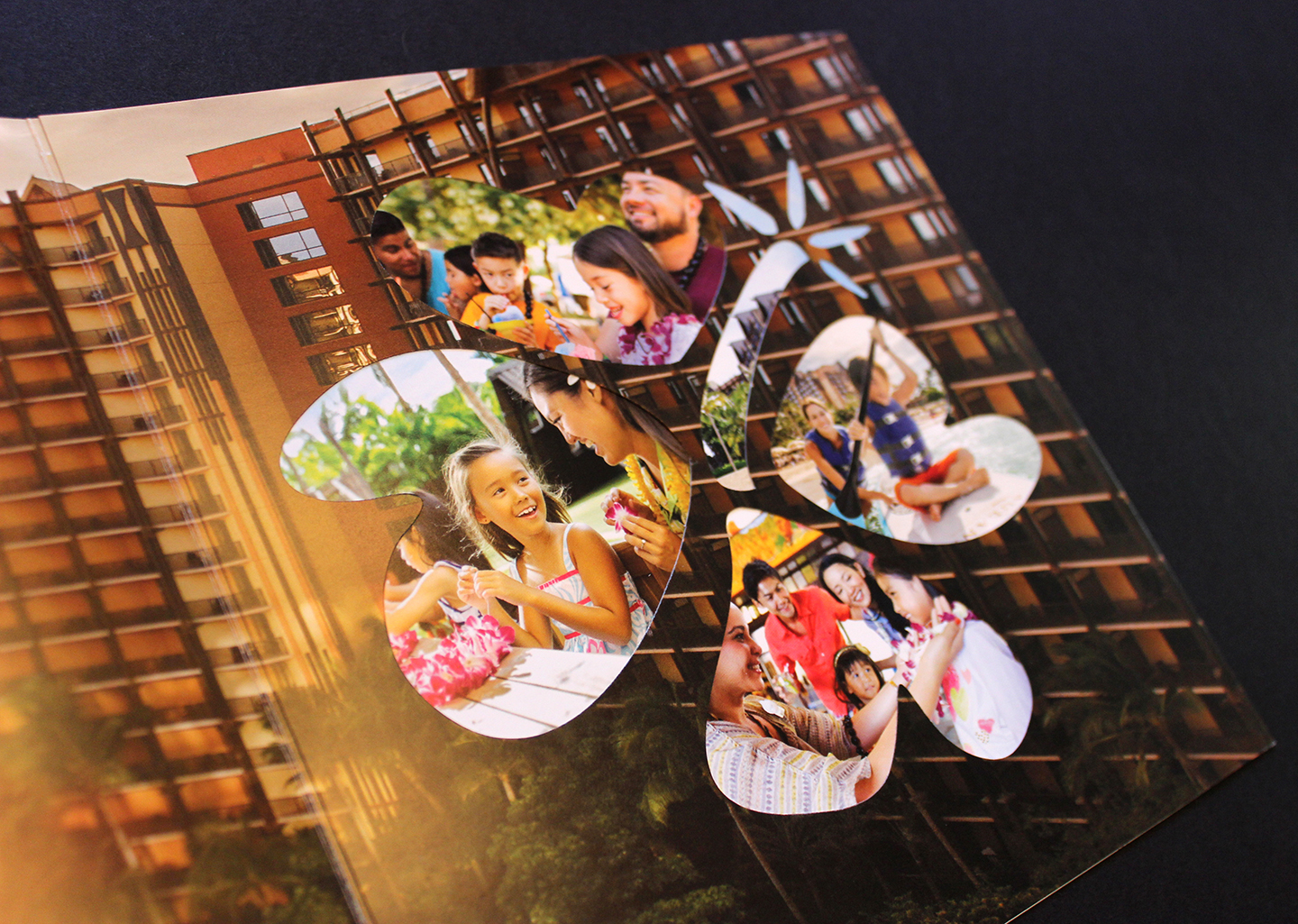
THE MAILER – For the mailer, we wanted to do something larger and in unusual dimensions that would attract attention when received in mailboxes. For that reason we went with a square design. In order to add some weight to the piece, we went with a 120 lb weight cover. The element that makes it real special is the use of a dye cut in the shape of a flower, which is used as a framing device to expose some of the most beautiful and colorful photography of the resort. The panels were all built together on each of its sides. This means that a lot of measuring was involved to ensure that the images would fit seamlessly when the panels closed over each other. In looking at the front panels below, the front panel (image of dad and child) on the right, and the panel next to it in brown (the back panel), were the same size. The other two panels' width were smaller in order to fold internally. The dye cut panel was glued onto the panel next to it in order to create the framing effect. The whole mailer was also glued with glue dots on the top and bottom corners (inside the front panel), in order for the packet to stay together.
UPDATE – On April 2017, the Credit Union National Association awarded a Diamond Award for excellence in direct mailer marketing.
The mailer with four distinct panels that when closed, connects the images together. The magenta area shows the dye cut.
Detailed sample of the mailer interior with the first panel opened; Detail of dye cut showing lifestyle photography.
THE PRE-APPROVAL OFFER LETTER – The letter came in a customized envelope that carried more of the colorful photography of the resort. The offer letter inside is legal size needed to fit all the required disclosure for the offer. The letter was designed following the brand style guide where photography assets are organized with white stroking without overlaps.
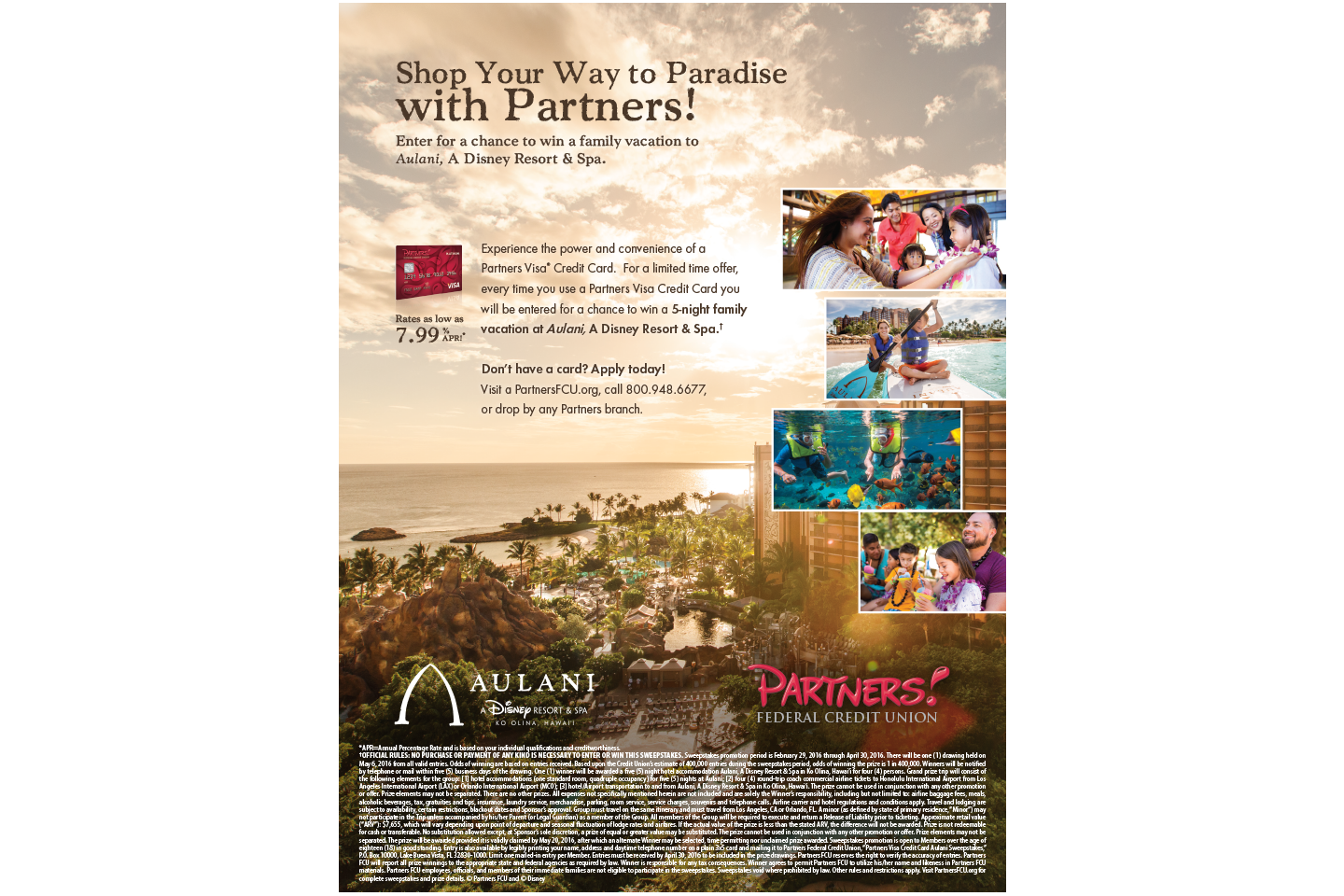
PRINT AD – The only other print item designed for this effort was a full page print ad that appeared for several print runs of various local magazines. The print ad followed the same overarching photography and layout style.
DIGITAL – The rest of the materials produced for this project were digital graphics for the consumer website and email deployment. These were created using Photoshop. The email included animated gifs of changing photos. The same images were used on the digital channels to connect with the print collateral.
Consumer web site hero image.
Banner ad for pre-approved customers.
Email sample.


